
6C MODEL

The 6C Model is my design process inspired by the 5C model. I added ‘communicate’ as the 6th step in the cycle because I believe the promotion of the product is also part of the development process.
1.COLLECT
Understand the essential experience of the ONE competitor app
Understand the target and goal of the ONE competitor app
Competitor, usability and the durability of the ONE competitor app
2.COMPREHEND
Analyse the target users and focus group
Analyse the usability including UX, UI and functionality
3.CONCEPTUALIZE
Re-design the essential experience and product goal
Re-design the UX & UI based on the existed functionality
4.CREATE
Use wireframe & sketches to plan the designs
Use physical materials to build prototypes for user testing
Use Adobe CC and Figma to create digital versions of the product
Test, listen and improve
5.COMMUNICATE
Upload the finished product to the websites or platforms to build connections with the community and receive feedback for the future development
Promote the product
COLLECT
As the most popular medical app in the UK(ranked by Similarweb), The NHS app will be my core analysis target.

KIPLING’S CHECKLIST (5W1H)
I started the ‘comprehend’ section with the 3 competitor analysis: Patient Access, Health Passport Worldwide and Livi. The reason for choosing these three apps is because they are all listed as the current top 10 trending healthcare apps, ranked by Similarweb:

CORE FUNCTIONS
Access the COVID support including covid pass, advice and information
Order repeat prescriptions
Book & manage GP surgery
Access health information and advice
Access health record
Register organ donation decision
Find out NHS personal data usage
What is the NHS app?
The NHS app is a digital application created and owned by NHS to help people who need medical support inside the UK
The NHS app became an important tool under the covid-19 restrictions
Who uses the NHS app?
People who require regular and emergency medical support
People who want to access the Covid-19 support such as the covid pass, vaccination record, covid test upload etc…
Why do people need the NHS app?
To access medical support
To access the Covid-19 support
When to use the NHS app?
The NHS app provides 24/7 medical support so users can use it at any time of the day.
Where to use the NHS app?
During the Covid-19 period, people use it to show their covid pass when travelling or attending events.
How to use the NHS app?
The NHS app is supported on mobile devices.
Tap and swipe are the basic interactions of the app on the touch screen
SECONDARY RESEARCH
I started the ‘comprehend’ section with the 3 competitor analysis: Patient Access, Health Passport Worldwide and Livi. The reason for choosing these three apps is because they are all listed as the current top 10 trending healthcare apps, ranked by Similarweb:
After two weeks of exploring different topics for FMP, my final interest lands on ‘senses’. The first related theme I can think of is synesthesia. This is an explanation of what it is:

Lara & Lucy’s analysis
I came across this theme a couple of times, but I didn’t get a chance to dive into it and do something around the topic, and I figure this might be an excellent opportunity to do it.
The first thing I researched was the types of synesthesia. According to Arefa Cassoobhoy, here are some typical types of synesthesia, see below:

INTERVIEW
After concluding the problem, I then moved on to some first-hand research to make sure that I am on the right track.
I was very fortunate to find an occupational therapist in China, who happens to be my aunt’s friend. She was kind enough to offer me a phone call and talk about my project. After a brief discussion, she pointed out three main issues about my concept:
1. SPD is a very personal thing. This means that different patients will have different SPD conditions, some could be heard, some could be feeling, and you have designed the treatment to adapt to each individual, not the other way around.
2. SPD is a serious condition and requires professionals to deal with it. It is almost impossible to create a single treatment that can simply help everyone, especially when I am not working with a professional.
3. SPD is a huge topic and it is more than just feeling uncomfortable with the senses, but also the loneliness from the mental side. Therefore, to help patients with SPD, a toy or equipment is not enough.
After receiving these comments, I realised that it is impossible to create something that can just help everyone, especially when I am not a professional.
Although she cut my thoughts on this topic, the OP guided me in another direction:
There are a small number of people in the medical field who are now trying to use synesthesia(I also talked to her briefly about this topic I started with) as a method to train people’s creativity, and she thought it might be a good idea to look into that.
This suggestion was extremely helpful because, in my previous research, I was focusing on the negative side of synesthesia instead of the positive, and having it swapped actually inspired me to wonder why do people consider it as a condition instead of an ability?
With this question, I then moved on to the next phase: Conceptualise & create.
It’s funny that after all this research, I actually returned to where I started:
SECTION ANALYSIS
The NHS app has decent functionality and a great user base. However, the lack of user-centred design makes it unpleasant to use. Based on the research and interview I conducted, we now understand that structure and affordance are its key weaknesses. In conclusion, the focus on the healthcare app design should be easy to use and have good accessibility. The stack of functionality is not going to help improve the user experience.
COMPREHEND
Using UX analysis methods to understand the product, user and its competitors

COMPETITOR ANALYSIS
I started the ‘comprehend’ section with the 3 competitor analysis: Patient Access, Health Passport Worldwide and Livi. The reason for choosing these three apps is because they are all listed as the current top 10 trending healthcare apps, ranked by Similarweb:
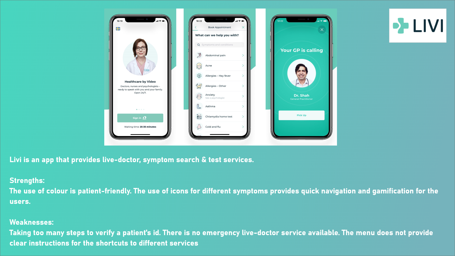


SWOT ANALYSIS
I started the ‘comprehend’ section with the 3 competitor analysis: Patient Access, Health Passport Worldwide and Livi. The reason for choosing these three apps is because they are all listed as the current top 10 trending healthcare apps, ranked by Similarweb:

It all begins with an idea. Maybe you want to launch a business. Maybe you want to turn a hobby into something more. Or maybe you have a creative project to share with the world. Whatever it is, the way you tell your story online can make all the difference.
USABILITY TEST
I started the ‘comprehend’ section with the 3 competitor analysis: Patient Access, Health Passport Worldwide and Livi. The reason for choosing these three apps is because they are all listed as the current top 10 trending healthcare apps, ranked by Similarweb:


Hello, World!
CONCEPTUALIZE
Re-designing the app based on the analysis results

HOW MIGHT WE…?
I started the ‘comprehend’ section with the 3 competitor analysis: Patient Access, Health Passport Worldwide and Livi. The reason for choosing these three apps is because they are all listed as the current top 10 trending healthcare apps, ranked by Similarweb:

It all begins with an idea. Maybe you want to launch a business. Maybe you want to turn a hobby into something more. Or maybe you have a creative project to share with the world. Whatever it is, the way you tell your story online can make all the difference.
PERSONA
I started the ‘comprehend’ section with the 3 competitor analysis: Patient Access, Health Passport Worldwide and Livi. The reason for choosing these three apps is because they are all listed as the current top 10 trending healthcare apps, ranked by Similarweb:
-

The first persona is an artist who wants to create art with his synesthesia ability. However, he is not sure whether his synesthesia is real or not. Therefore, he needs something to prove that he can make something with his synesthesia ability.
-

The second persona is a musician. She also has synesthesia but doesn’t know much about art. She wants to make her own music visualisation but the apps nowadays are too complicated to learn or hard to make personalised contents.
-

The third persona represents people who have synesthesia but don’t know how to use it. He wants to make friends with people who have the same condition and see what they can do with it.
-

The last persona represents the younger age group who have synesthesia. It is a great time to let children understand the meaning of synesthesia, and perhaps develop it to make them better at music or art.
Whilst making the persona, I realised one issue: Not every artist understands music, and not every musician know about art, so how might we solve the problem?
USER JOURNEY MAP
I started the ‘comprehend’ section with the 3 competitor analysis: Patient Access, Health Passport Worldwide and Livi. The reason for choosing these three apps is because they are all listed as the current top 10 trending healthcare apps, ranked by Similarweb:

It all begins with an idea. Maybe you want to launch a business. Maybe you want to turn a hobby into something more. Or maybe you have a creative project to share with the world. Whatever it is, the way you tell your story online can make all the difference.
IDEATION.
I started the ‘comprehend’ section with the 3 competitor analysis: Patient Access, Health Passport Worldwide and Livi. The reason for choosing these three apps is because they are all listed as the current top 10 trending healthcare apps, ranked by Similarweb:

Finally, I have come up with the initial idea, and here is the process: You start by choosing a sound from a set of sounds, then assign a colour and shape to it. For instance, I heard sound 1 and it feels like a blue square, so I assign both features to it. The same goes to sound 2 with a red triangle. So now we have two sounds, and by connecting them, a melody is created. You can also layer them on top of each other to create harmony.
The best part of this design is that it allows the users to choose the colours, shapes and sounds based on their synesthesia abilities. The mechanic of connecting & layering shapes is also very practical in terms of creating art & music.

Let’s continue with design: The more visible the colour, the louder the sound; The less visible the colour, the quieter the sound. You can also adjust the shapes: Stretch it, re-scale it or move it around. The end result will look something like the image in the corner. Notice that this isn’t just a piece of artwork, but also a piece of music you compose.
To make it more interesting and customisable, I designed a visibility system for the colours. It adds more depth to aesthetics and features more dynamics in the audio part.

Ideally, the outcome should look like Bauhaus art because the idea of using simple geometry to present organic shapes is very similar to what I am designing right now: using simple shapes and colours to compose music, and using simple sound to create visualisations.

It all begins with an idea. Maybe you want to launch a business. Maybe you want to turn a hobby into something more. Or maybe you have a creative project to share with the world. Whatever it is, the way you tell your story online can make all the difference.
Hello, World!
CREATE
Turning concepts into high-fidelity outcome

THUMBNAIL WIREFRAME
I started the ‘comprehend’ section with the 3 competitor analysis: Patient Access, Health Passport Worldwide and Livi. The reason for choosing these three apps is because they are all listed as the current top 10 trending healthcare apps, ranked by Similarweb:

In this wireframe, I mainly focused on the assigning phase. As you can see above, I was trying to figure out how it will work: You are given three choices at the beginning: Colour, shape and sound. Choose one to start assigning with first, then move on to the next feature. But this then became an issue later on: If there are three objects, why am I only assigning one?


WIREFRAME 1.0
After creating the digital wireframe, I then tested it with my friend to see how it would work.

There are two main issues spotted after this test:
1. Mobile phone screen is too small to handle the external menu;
2. There isn’t enough space for creating music because the screen is too small.
To fix the issues, I need to use a bigger device to make sure users have enough space to call the external menu and enough space for them to work on. I chose the iPad as my device.
WIREFRAME 2.0
Once the thumbnail is done, I then created a more detailed digital version to showcase the entire interaction of the app:

WIREFRAME 3.0
I started the ‘comprehend’ section with the 3 competitor analysis: Patient Access, Health Passport Worldwide and Livi. The reason for choosing these three apps is because they are all listed as the current top 10 trending healthcare apps, ranked by Similarweb:


Prototype 1.0
After prototyping, I noticed a couple of things:
1. White background is distracting from creating things
2. It is hard to express the idea of Bauhaus from what it currently looks like
3. There are way too many colours, and I need to limit them
4. The interactions need to be more accessible, for example, needs to have a feature to access to playback of the music
WIREFRAME 4.0
I started the ‘comprehend’ section with the 3 competitor analysis: Patient Access, Health Passport Worldwide and Livi. The reason for choosing these three apps is because they are all listed as the current top 10 trending healthcare apps, ranked by Similarweb:
ART STYLE.
I started the ‘comprehend’ section with the 3 competitor analysis: Patient Access, Health Passport Worldwide and Livi. The reason for choosing these three apps is because they are all listed as the current top 10 trending healthcare apps, ranked by Similarweb:
-

I started with the three fundamental colours and shapes: 1. Red, blue and yellow ;2. Square, triangle and circle.
I chose them because they are the best representations of Bauhaus. -

After experimenting with a couple of shapes, I noticed that the structure of square, triangle and circle looks like BAU IN Bauhaus.
-

The third persona represents people who have synesthesia but don’t know how to use it. He wants to make friends with people who have the same condition and see what they can do with it.
-

I changed U from BAU to BAO because it suits better with the shapes and makes it differ from other apps that may be called BAU.
Prototype 2.0
So far, everything looks fine, and the animation seems accessible as well. Notice that I changed the three dots to a bar because I was thinking about having this function to shift the colours. However, it looked redundant during the testing, so I decided to change it back to the dots.
The biggest change I made was limiting the number of colours users can assign because they are the four fundamental colours of Bauhaus. Another thing I did was to add a ‘question mark’ icon on the left-hand side corner. The idea is to have a tutorial interface that you can access by tapping on the icon at any time if the users are stuck. The last feature I changed was the setting icon on the right-hand side of the screen. I changed the three dots to the ‘skip’ button in the music player to match the thinking.
Wireframe to finished images
Showcase Video
It all begins with an idea. Maybe you want to launch a business. Maybe you want to turn a hobby into something more. Or maybe you have a creative project to share with the world. Whatever it is, the way you tell your story online can make all the difference.


COMMUNICATE
Talking about the future improvements of the app