
or continue scrolling to see the process
OVERVIEW
Summary
The project aims to transfer my UI design skills to video games - Turn ‘Control’ into a mobile game.
Control is a 3rd-person action game designed for console and PC users. The goal is to apply UX design methods to adapt the game's GUI for mobile users, providing them with a seamless and optimised gameplay experience.
Role: UI Designer
Duration: 3 days (November 2022)
Methods: Kipling’s Checklist, Usability Analysis, Primary & Secondary Research, Persona, User Flow, Wireframe Hi-fi prototype.
Problem
Control is a game designed to play on controllers, keyboard and mouse, but for mobile devices, it has to be touch-based.
When porting the game to mobile devices, the original mapping needs to be re-design to adapt to the gameplay, especially in combat.
Players might have different devices that display the game in various scales, which may cause interaction problems during the game. (Ipad and iPhone require different hand gestures to interact due to the scales differences of their screens)
Tools: Figma, Illustrator
Solution
Re-design the shortcuts and buttons to ensure the players have essential character control without problems.
Adapt the advanced mechanics with easy access by using touch-based designs.
Adapt the UI with multiple devices to ensure it delivers the same experiences to all players.

So, what if Control is a mobile game…?
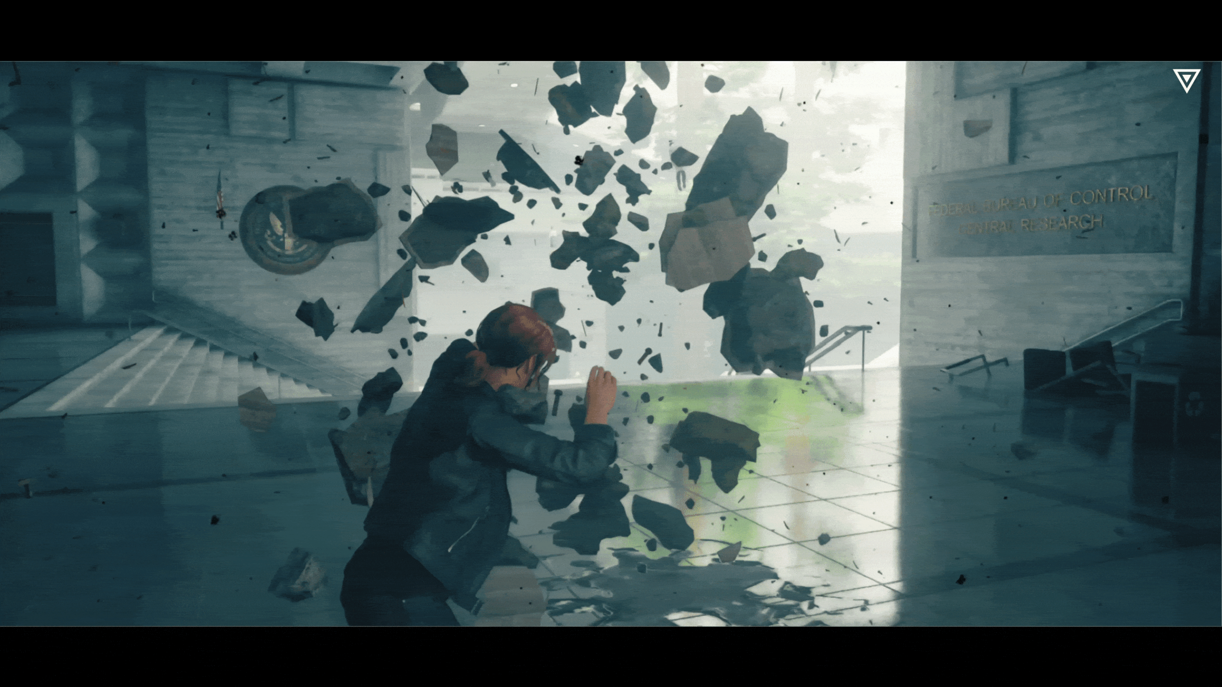
I'm a massive fan of Remedy games, and I absolutely love CONTROL. As I was playing through the game with Jesse Faden, I started thinking about what it would be like if CONTROL was available on mobile devices. And then I started wondering how they'd adapt the combat UI for mobile gameplay.
COLLECT
Kipling’s Checklist
Although I’m only designing the UI, it’s always good to have a clear picture of what and who I am designing for.
A couple of things to note.
Designing a graphical user interface (GUI) for mobile platforms is a unique challenge due to the interactions involved. While other platforms may rely on traditional inputs such as 'press' and 'hold', mobile games incorporate other ways of interaction like 'swipe', 'hand gesture', and even the gyroscope sensor. Additionally, since players interact directly on the screen, their hands tend to cover at least half of it, making it crucial to consider how the GUI elements are positioned and sized for optimal gameplay.
Play through & Screenshots
The first thing I did in this section was to play through the game and document the existing mechanics, UI and other things that may affect the gameplay & player interactions:


Straightforward mechanics.
After conducting a primary playtest, I observed that Control features relatively straightforward mechanics, making it a good candidate for a mobile device port.
COMPREHEND
Usability Analysis - HUD
Based on the results above, it is not hard to tell that the UI designers were trying to minimise the UI and let the players focus on the screen more. This is not only due to the art direction but also the many combats players encounter during the game. I did some usability analysis to understand the information the designers were trying to deliver through the existing UI.


Usability Analysis - The controls of CONTROL
After the usability analysis, it’s time to move on to the character's controls. The goal is to understand how designers used the minimum number of interactions/buttons to create a fluent combat flow. I documented the buttons used in CONTROL and divided them into two categories: Basic and advanced.

Dividing the controls helped me understand the game's primary and secondary inputs, which will come in handy when designing the input layout for mobile devices.
Straightforward inputs.
It's evident that Control features simple and intuitive controls that enable players to engage with the game seamlessly, regardless of whether they're playing on a mobile device or another platform. It's apparent that the designers aimed to minimise player interactions, creating a more streamlined and straightforward gameplay experience.
Primary & Secondary Research - Mobile Game HUD
After the usability analysis, it’s time to move on to the character's controls. The goal is to understand how designers used the minimum number of interactions/buttons to create a fluent combat flow. I documented the buttons used in CONTROL and divided them into two categories: Basic and advanced.

What I like about GTA: San Andreas mobile is that the movement stick at the bottom is hidden when the character stays idle. It only appears when the player touches the screen's left half. Such design minimises the number of icons display on the screen and makes the game user-friendly. Another excellent idea is the little arrow on the ‘car’ icon, indicating the vehicle's location.
Call of Duty: Mobile
COD: Mobile has a very straightforward HUD that covers all the fundamental interactions, such as moving, shooting and switching weapons. Notice that all button sets are placed at the bottom corners due to the way players hold the mobile devices. Interestingly, COD: Mobile also divides the interactions into two categories, which can be shown in the size of the buttons: Basic buttons are larger than advanced buttons. In such a way, players can pick up the game and learn how to play very quickly.
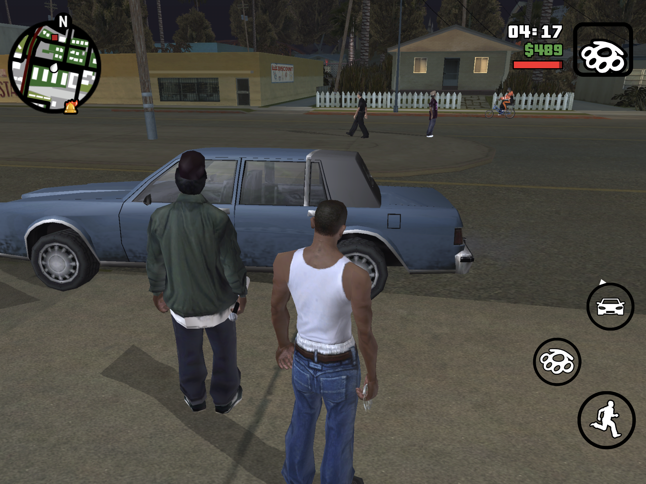
Grand Theft Auto: San Andreas

IDLE
RUNNING

Alien Isolation Mobile
Movement speed is an essential mechanic in Alien Isolation. The designer has done a great job minimising the buttons to allow the players to switch between walking and running with simple interaction. As we can see from the bottom left corner, a line connects the movement icon and the sprint icon, informing the players that they simply push the button up to sprint instead of pressing another button on the side.
CONCEPTUALISE
How Might We…?
Now we have a basic picture of mobile shooter games’ UI, and it’s time to conceptualise the idea.
The first step is to ask the critical questions - How Might We…

Persona
It is essential to clarify player needs and frustrations before creating anything. Therefore, I made two personas representing mobile phone and tablet players.


Know the players.
Understanding the target audience is crucial when designing a GUI for a mobile game. Unlike designing for console players, mobile phone users have different usage habits and goals. To create a tailored design for this group, I created personas to better understand their needs and preferences.
Ideate
Based on the personas, I discovered a few problems and their potential solutions, which led to the ideation before moving onto the creation phase.

CREATE
User Flow
From ideating, I realised the importance of dividing the mechanics into primary and secondary categories. The idea is that the primary mechanics will always be the ‘parent’ button which can be used as a way to trigger the secondary mechanics/buttons

Sketches
Here are some sketches I made to visualise the design based on the user flow:


Wireframe
Now it’s time to do some wireframes I created to showcase the HUD layout and how the digital buttons trigger mechanics:


OUTCOME


The biggest issue with porting a console game to mobile devices is that the screen is smaller, and the mechanics have changed from button to touch-based. The players can only trigger something by interacting with the screen.
The stack of digital buttons will cover almost half of the screen, giving the players less room to see what’s going on in the game. To fix this issue, I divided the mechanics into two categories: Primary and Secondary.
The primary mechanics will always be the basic movements such as walking, shooting, aiming, jumping and using abilities. These mechanics can be triggered anytime during the game, most of which are displayed as digital buttons on the screen.
Secondary buttons are the advanced mechanics that are ‘child’ from the primary buttons; this means that they can only be triggered after a primary mechanics is active; for example, JUMP is a primary mechanic triggered by tapping on the ‘JUMP’ button, and Levitate is a secondary mechanic triggered after holding down the same button.
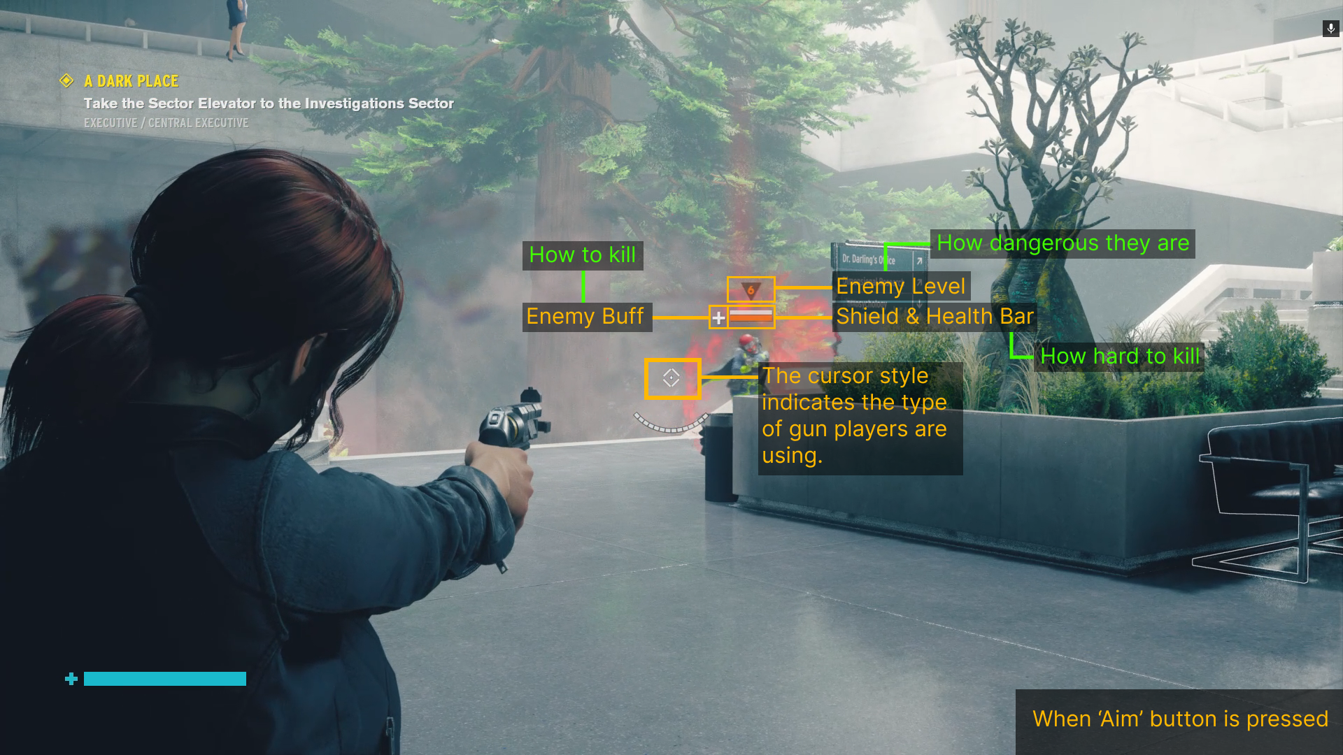
The cursor next to the ‘SHOOT’ button indicates the type of weapon players are currently holding. Players can switch weapons by tapping on the cursor, just like in the original game.
As a primary mechanic, players can access the ‘MAP’ button on the top right corner. It will also take them to other menus such as Settings, Collectibles, Missions, Assets and Loadout.
To make shooting more accessible, the character will start shooting after players hold down the ‘AIM’ button. The design is to avoid using two buttons to ‘aim’ and ‘shoot’, allowing players to move around whilst shooting. Furthermore, players can also tap the ‘Toggle Side’ button to switch the camera sides.
It’s also worth mentioning that the navigation system wasn’t pleasant to use in the original game, and players can easily get lost in the complex environment. To enhance the feature, I added a navigator on top of the screen so that the objective icon would guide the players in that direction.
In the original game, abilities are triggered by multiple buttons, which is impossible to do on mobile devices whilst having minimal elements on the screen. To solve the issue, I redesigned how players trigger the abilities - Abilities no longer required to hold and released to trigger specific effects. Once the button is pressed, it is identified as ‘hold’, and when pressed again, it will be identified as ‘release’. Holding down the digital button will now call the ability wheel, in which players can switch between the abilities and use them in combat. During the ability wheel, the game will enter slow motion for players to browse the ability attributes and decide which to use.
To minimise the number of buttons appearing on the screen, the movement stick is hidden when the character is not moving.
Once the character starts moving, there is a ‘SPRINT’ button on top of the movement stick, which the player can push the stick a little further to trigger the sprint mechanic.
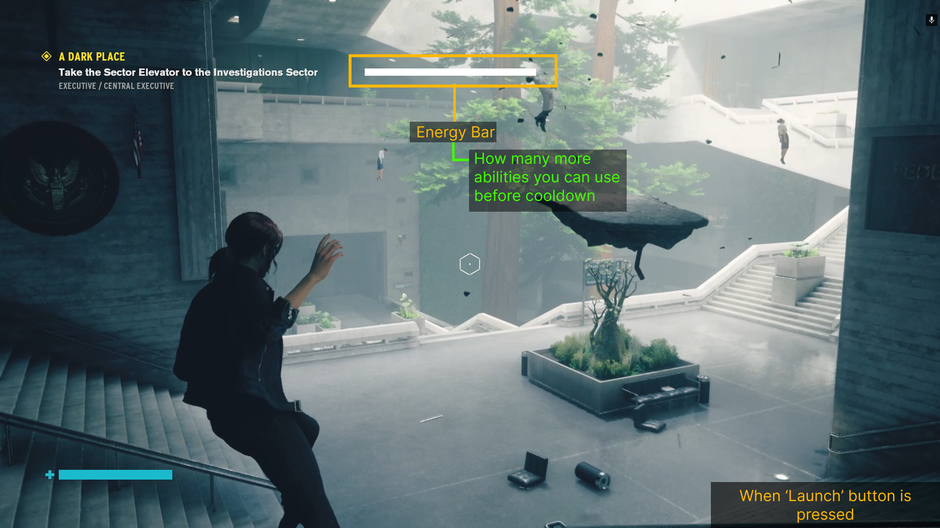
Press the ‘Ability - Launch’ button to pick up an object, and then press it again to release it.
Using abilities costs energy. The energy bar is redesigned into separate blocks to give players a better idea of how much energy they have left.
Press the ‘Ability - Shield’ button to generate a shield, and press it again to release.
Press the ‘JUMP’ button to jump, hold or double tap to Levitate.
Press the ‘Evade’ button to evade, and hold to crouch.
Like the Health Bar and the Energy Bar, I also redesigned the enemy UI so the players can see how much damage they can apply to the enemy’s shield. The enemy position now will appear on the navigator as a red diamond. The size indicates the distance between the players and the enemies.