
or continue scrolling to see the process
OVERVIEW
Summary
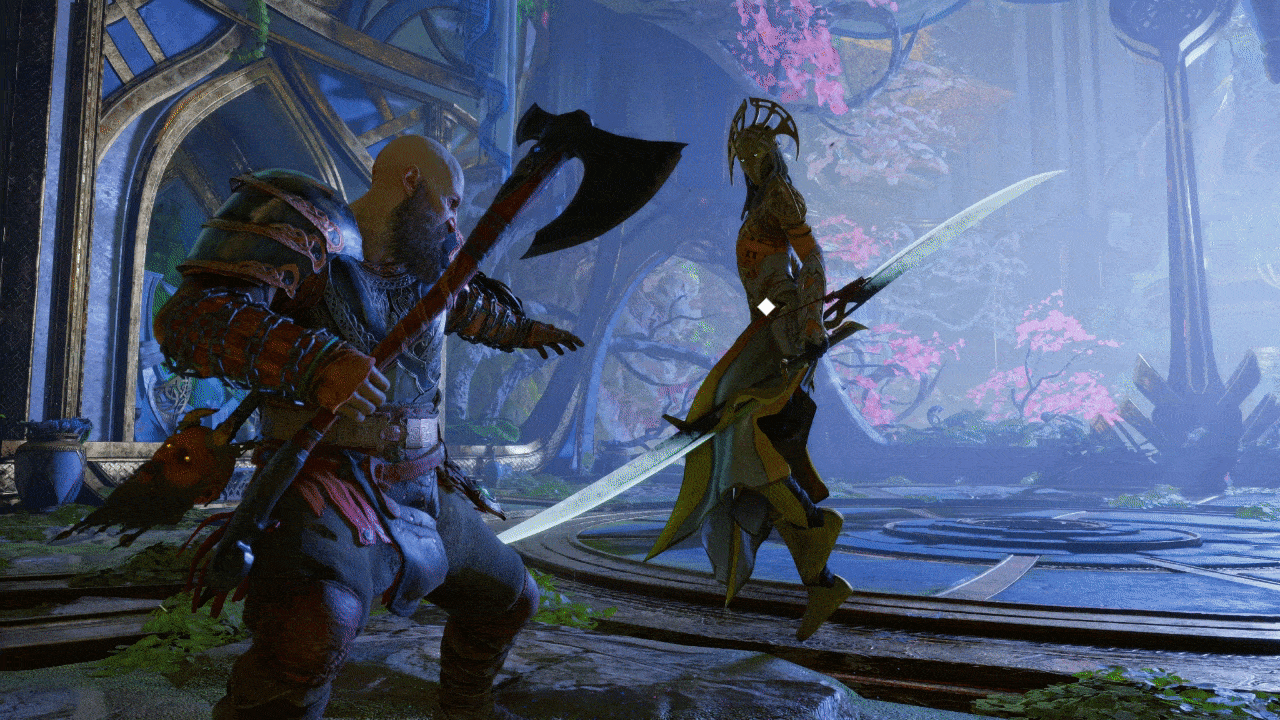
The project aims to redesign the UX and UI for God of War: Ragnarok.
The goal is to improve the game's usability and overall gameplay experience by addressing UX issues. The redesigned UI incorporates a new font, highlighting features, improved weapon and equipment visualization, categorized abilities, dynamic navigation icons, and a more intuitive navigation system. These improvements aim to create a more engaging and enjoyable gaming experience for players.
Role: UX/UI Designer
Duration: 1 week (December 2022)
Methods: Usability Analysis, Primary & Secondary Research, User Flow, Wireframe Hi-fi prototype.
Tools: Figma, Illustrator
Problem
The problem is that the original user interface design of God of War: Ragnarok was causing issues with the game's usability and overall gameplay experience. Players were experiencing problems with cluttered screens, hard-to-read fonts, confusing menus, and inefficient navigation systems.

Why am I doing this?
As a God of War fan, I detected significant problems with the UX and UI in Ragnarok. While I comprehend the designers' need to choose between aesthetic and accessibility, I believe a better compromise should be struck between the two.
COLLECT
Secondary Research
Even though this is a case study with a focus on GUI, it is essential to begin by collecting player feedback from the gamer community.
1. Reddit - UI for Ragnarok is so poorly designed:
It seems like the issue that people talk about the most is the font size and the layout. The misalignment between the icons and texts makes the UI look ‘ugly’.
2.Malewicz - I wish the UI was as good as the game:
In this video, Malewicz talked about how the UI is poorly placed in the menus, which causes several UX problems. He also made a very good point about the inconsistency of the icons, which makes the visual less intuitive.
3.THOMAS MCNULTY - God of War Ragnarök's Worst Choice Is Ripped From Marvel's Avengers
“God of War Ragnarok delivers intense combat and an emotional story, but the mythic sequel's user interface fails to match the sterling quality of the rest of the game. The game's menus are crowded with information and symbols while loot, gear and abilities are spread out across several tabs and screens. The menu text is incredibly large, too, forcing players to scroll down just to read the stats and perks of an armor set or weapon attachment. The menus in God of War Ragnarok are also artistically underwhelming, making them come across as generic rather than reflecting the unique qualities of the mythological epic. None of these issues were present in 2018's God of War, but were sadly introduced in Ragnarok.”
In Thomas’s article, he highlighted the ui elements are overcrowded with information and symbols. Several buttons are spread out across multiple tabs and screens that cause trouble when accessing.
Wow, that’s harsh…
To summarise, the majority of the player community is expressing negative feedback regarding the UI design of Ragnarok. The most common issue being discussed is the excessive font size which creates an overcrowded and cluttered UI filled with icons, text, and buttons. Additionally, there are alignment problems that cause visual issues. In light of these issues, it is necessary to redesign the UI to address the problems raised by the player community.
COMPREHEND
Usability Analysis
Based on the research findings, conducting a thorough analysis of the UI is a wise decision. By taking a closer look at the UI, you can identify specific areas that need improvement and develop a strategy to address the issues raised by the player community. Through this process, you can create a more user-friendly and engaging UI design that enhances the overall gameplay experience.
The UI design contains excess information that takes up too much space, while crucial details such as the character's level are tucked away in a corner.
The presentation of the weapon parent and child panels is confusing to players unfamiliar with the game, as the icons and text are separated into different panels.
The location of the navigator at the bottom of the screen makes it less accessible than if it were positioned at the top.
The UI appears overcrowded, leaving little breathing room for players to comfortably navigate the menus and options.
The issue of redundant processes also occurs in the skill menu, where the parent and child panel issue requires players to take two steps to access the page when it could be done with just one.
The size discrepancy between certain icons is confusing for players.
The organization and placement of the required level to unlock skills across the skill trees is confusing and appear random.
As ordering Atreus to shoot arrows is also a player ability(1B), having it relegated to a separate corner (1A) of the screen can make it difficult to navigate and check its availability during combat.
The icons in the navigator bar are overloaded with elements, making it challenging to explore. Players can only determine distance by the numbers next to the icons, and the icons themselves are poorly designed and do not communicate information effectively. A redesign of the icons is necessary.
Similarly, the icon for the tips does not effectively communicate with the content it represents.
So, here is the problem:
The 'weapon' and 'skill' menus appear to be the areas where the most problems arise, and will be the focus of my attention. However, there will also be small changes made to the navigator, tooltip, and combat UI to enhance the overall user experience.
CONCEPTUALISE
Ideate
To ensure a successful design process, I have identified three crucial problems that will impact the UI redesign, along with their potential solutions:
User Flow
From ideating, I realised the importance of dividing the mechanics into primary and secondary categories. The idea is that the primary mechanics will always be the ‘parent’ button which can be used as a way to trigger the secondary mechanics/buttons
Learn from the best.
My inspiration for this project came from popular games like Assassin's Creed Valhalla, Destiny, and The Witcher, which offer effective solutions for RPG game interfaces. I believe that by implementing a similar UX design, Ragnarok can effectively convey crucial information to players.
CREATE
Thumbnail Wireframe
I find that using thumbnail wireframes is a valuable approach for mapping out the basic layout of the new UI. By creating small sketches of the proposed design, I can quickly test different layout options and identify potential issues early in the design process. In this case, I made some small wireframes for the weapon menu, skills menu, combat UI and navigator UI.
Wireframe 1.0
Based on the user flow and the thumbnail wireframe, I started to map out my ideas in Figma.
In order to create more visual space for the UI, I made the decision to move the character to the center of the screen. Additionally, I merged the 'weapon' and 'armor' panels into a single panel, allowing players to browse items together instead of having to switch between tabs.
To enhance the skill tree menu, I categorised the abilities into four distinct levels instead of having numbers placed randomly on each skill. Additionally, I made the XP more prominent so players can easily check it while browsing the skill trees.
As mentioned earlier, Atreus' shooting is considered part of the player's ability set. As such, it is easier to navigate the cooldowns when they are all presented together in one place.
The addition of a new 'hover' feature allows players to view brief weapon information using the cursor, instead of being forced to view the entire panel. Alternatively, players can still access the weapon details panel by clicking on the item.
Similar to the weapon panel, players can hover over a skill to see its details and view a video demonstration of the specific skill.
The objective icons in the navigator now change size depending on the distance, which improves accessibility for players.
Wireframe 2.0
Based on the user flow and the thumbnail wireframe, I started to map out my ideas in Figma.
I rearranged the layout of items, placing weapons on the left and armours on the right. Additionally, I added button instructions in the game to help players understand which button to use.
To improve accessibility in the skill tree panel, I made two changes from wireframe 1.0. Firstly, in addition to categorising skills into levels, I also divided them into 'primary ability' and 'secondary ability', with the former being displayed with a bigger icon than the latter. Secondly, players can now see the ability information panel immediately when clicking on a specific skill.
Finally, I rearranged the position of the objective icons to make them appear above the navigator bar, improving the overall aesthetic of the UI.
Given that Atreus' ability is frequently used in the game and is now separate from Kratos' abilities, I made his icon bigger in the UI. Additionally, I added a button instruction in between the icons to provide a clearer idea of how to use the abilities.
Before & After
Based on the user flow and the thumbnail wireframe, I started to map out my ideas in Figma.
ORIGINAL
REDESIGN
ORIGINAL
REDESIGN
ORIGINAL
REDESIGN
ORIGINAL
REDESIGN
In conclusion…
By rearranging the layout, categorising skills and abilities, creating hover features, and implementing various other improvements, I believe the game's UX and UI can be significantly enhanced, resulting in a better overall gameplay experience.

This is where the link will jump to
To enhance the visual appeal of the game, I incorporated a new font and implemented a highlighting feature to emphasize selected words.
I reorganised the UI layout to include a clear and concise visualization of the currently equipped weapons and equipment. To achieve this, I separated the "weapons" and "armor" into two distinct sides, which created a more efficient navigation system. Additionally, I added a section at the bottom of the screen to display the character's level, along with other relevant information, while maintaining a clean and uncluttered interface.
My new design incorporates a significant improvement that allows players to use the analogue stick to move a cursor around the screen instead of relying on arrow keys. This feature enables a "hover" function, which enables players to view the status of their weapons without having to select them. While they can still access the status menu to customize their weapons, this new approach offers a more intuitive and seamless user experience.
The original skill tree menu displayed the unlock levels for each ability, which made it difficult to navigate. To enhance the user experience, I categorized each ability into different levels, making it easier for players to understand when they can unlock certain abilities. Additionally, I redesigned some ability icons to improve their visibility and make them more intuitive.
Players can now view Kratos' ability cooldowns alongside Atreus' abilities, which provides a more comprehensive view of their available options. This change enables players to strategize more effectively during combat, enhancing the overall gameplay experience.
I redesigned the navigation bar located at the top of the screen. The icons representing different locations now dynamically resize based on the character's proximity, with larger icons indicating closer destinations. Additionally, I readjusted the position of distance information below each icon to prevent any potential clashes, resulting in a more intuitive and streamlined navigation system.