
Role: UX/UI Designer
Timeline: 04/2022 - 06/2022
Type: Conceptual Case Study
Tools: Figma, Adobe CC
MediMe
Summary
MediMe is a mobile medical application that aims to help reduce medical inconveniences during the covid-19 outbreak. As the UX designer, I created this project from scratch into a high-fidelity model through research, analysis, ideation and prototypes.
-
The Net Promoter Score increased by 70% from the initial testing to finalisation.
-
Elderly adults have been struggling to access medical services during the pandemic due to limited mobility and concerns about exposure to the virus. Many face difficulties adapting to multiple apps and changing their usual habits to access medical services during the pandemic. They often find it confusing and time-consuming to navigate through different apps, leading to frustration and a lack of trust in technology.
-
Develop a solution that eliminates difficulties for elderly adults when accessing medical services.
-
Developed an app that consolidates all medical services into one platform, eliminating the need for elderly adults to switch between multiple apps. This reduces the learning curve and minimises changes to their usage habits, making it easier for them to access critical services.
-
Kipling's Checklist, Secondary Research, Interview, Experience Map, Persona, Competitor Analysis, Usability Analysis, How Might We, Information Architecture, Wireframes, Prototyping, User Testing

The story begins…
The COVID-19 pandemic has had a profound impact on global medical services. Medical facilities have been overwhelmed, making it difficult to provide care. Routine services have been interrupted or moved to remote technologies due to the risk of transmission. This reliance on technology in the medical industry has sparked me an interest in exploring any underlying issues that need to be addressed.
“I began with primary and secondary research to identify our target audiences and the potential issues they face.”
Kipling’s Checklist
I used the 5W1H approach to extract critical information about the impact of the COVID-19 pandemic and better understand the needs of those who require solutions. I conducted secondary research to obtain information and presented the answers as shown below:
The elderly population face more challenges.
The COVID-19 outbreak has challenged the health system with overwhelming demand, staff shortages, and medical equipment shortages. This has limited resources for other illnesses, putting the elderly at higher risk due to physical limitations and isolation rules.
According to Nayyara Tabassum’s research:
“We need more concerted and thoughtful efforts to help older people with digital technology and making their lives easier, particularly during the COVID-19 pandemic.”
“Out of the 18 digital solutions awarded up to £25,000 under the TechForce19 challenge to help vulnerable or isolated people during the pandemic, only one solution, Just Checking, specifically caters to older people. Just Checking provides activity monitoring systems used by local authorities to assess older people in their homes for social care purposes.”
Secondary Research
Why should we choose the elderly population as our target audience?
Elderly people have shown a positive attitude towards using technology, particularly during the outbreak.
According to the paper published by Andrew Sixsmith, Becky R. Horst, Dorina Simeonov, and Alex Mihailidis
“While older adults feel more isolated in 2020, many feel positive about the benefits of technology and have increased technology use during the pandemic to support their health, wellness, and communication needs.”
“The results highlight the potential of technology for supporting older adults in various aspects of healthy aging.”
Let’s help elderly people!
Secondary research has indicated the significant potential for developing technologies aimed at older adults, especially during the COVID-19 outbreak. One of the most significant solutions that could help elderly people access medical services more easily and efficiently is technology.
“I interviewed 10 elderly people to discover their pain points in accessing medical assistance during the pandemic.”
Interview
I interviewed ten individuals between 55 and 78 to determine their habits and opinions regarding accessing COVID-19/medical services or news during the pandemic. Here are the results:
I asked:
How have you been accessing medical services during the pandemic?
Do you find it easy or difficult to use technology to access medical services? Why?
How do you feel about the changes in how medical services are being delivered during the pandemic (e.g., more telehealth appointments)?
Have you experienced any difficulties or challenges when using technologies or accessing medical services during the pandemic? If so, what were they?
Pain Points
Why are most services mobile apps?
The interview revealed that older adults use mobile phones to handle medical issues due to familiarity, portability, and accessibility features. This convenience is especially useful for those with limited mobility or who cannot leave their homes frequently.
“Based on the research above, I created a series of experience maps and personas to highlight the struggles of our target users in accessing medical services during the pandemic.”
Experience Map
Here are three experience maps I created based on the interview.
Making a phone call to book a GP appointment
Showing covid pass when attending an event
Trying to keep up with the latest covid policies and news
Persona
By identifying the challenges individuals have faced, I can develop a series of personas that address their requirements and concerns.
Users are looking for alternatives.
From the research and analysis I conducted, it can be inferred that users are seeking alternative methods to access medical services, including but not limited to Covid Pass, GP services, prescriptions, and other services that were previously not required or conducted in-person before the pandemic.
“I conducted analyses on competitors to see how they’ve improved our target audience’s experience and potentially addressed their pain points.”
Competitor Analysis
Medical apps face competition from other healthcare providers, which could limit their market share. Consequently, it is crucial to examine other companies and determine why people choose to use their services. Here are the top three most downloaded apps according to Similarweb (apart from the NHS app):
Usability Analysis
Given that the NHS app has been downloaded 29.69 million times and is the top medical app in the UK, it presents an excellent opportunity to conduct a usability analysis to understand why it has received low ratings of 2.9 on the Appstore and 3.1 on GooglePlay, with usability being the most common complaint in both review sections. By conducting this analysis, we can gain insight into how the app's user experience can be improved.
Overall, the NHS app provides a solid foundation for users to access different services, thanks to its intuitive icons and helpful shortcuts. However, improvements could be made to the layout of the icons and text.
Firstly, the 'Home' button is not easily noticeable, located in an obscure corner of the interface. Secondly, the Feedback button obstructs other elements on the side. Thirdly, the 'Help' button leads to a page that takes a few seconds to load, causing delays. Finally, the unorganized information and wasted space could be better organized and utilized to improve the user experience.
Most medical apps offer only one service.
While some medical apps offer multiple services, users may still need to download and use multiple apps to access all their necessary medical services. This can be particularly inconvenient and consume valuable storage space on their devices. Additionally, different apps may have varying user interfaces, making it more challenging for users, particularly the elderly, to navigate and utilize them efficiently.
“After identifying a key issue hindering elderly people’s access to medical services through technology, I decided to conceptualise a solution focused on this challenge.”
How Might We…?
Having identified some issues through the ‘Collect’ and Comprehend’, we can now utilise the 'HOW MIGHT WE' approach to gain insights for the potential solutions.
Ideate
One last step before jumping into the designing phase is ideation. This section aims to list all the potential solutions and key points before working out the visuals.
An app that contains all the core medical services.
An app that allows users to access the COVID Pass system without having to log in.
An app that aims to provide shortcuts to improve the convenience of usage.
“Once the initial ideation is completed, it is time to make the basic sketches of the product.”
Information Architecture
Following the ideation process, I categorised all the functions into primary and secondary groups. This allowed for a clearer design of the app's shortcuts.
Wireframe
This is one of the wireframes I created based on the user flow.
Prototype
After creating wireframes, I converted them into an interactive prototype using Figma and then conducted usability testing with a few of my interviewees.
“It is important to conduct testing sessions throughout the production process. I used the NPS system to determine user satisfaction in each phase ”
First Testing
To test the accessibilities and doability of the app, I conducted a test session with ten people, and here are the results:
Finding:
During the app testing with six interviewees, the overall feedback was positive in regards to the services and aesthetics. However, the issue of instructions arose as six out of ten participants asked for help or reported technical issues during the session. The users mentioned they were not familiar with technology and would benefit from assistance in using the app.
Solution:
To solve the issue, I added a new service called 'Helper.' Helper is an AI-driven Q&A system that allows users to input their questions through typing or voice control. This system enables users to ask questions regarding the app or be directed straight to the specific page they need. This solution will enable users to seek assistance whenever they need help, thereby improving the usability and accessibility of the app.
The new feature added to improve the user experience:
In the end, I requested testers to provide responses that would allow me to calculate the current Net Promoter Score (NPS) and assess the project's current status. The results are as follows:

Design for elderly users ≠ Large and ugly UI.
The prototype testing with older adults emphasised that designing for elderly users requires more than just using larger buttons or UI elements. It is essential to consider accessibility and how well they can keep up with current technologies when designing for their needs.
“I redesigned the functions and features based on tester feedback and conducted a WCAG 2.2 evaluation, adjusting the visuals and experience accordingly.”
Usability test - before and after
After making changes to the services based on feedback from the first testing session, users expressed satisfaction with the current version of the app and began providing further suggestions to improve usability.
I requested another Net Promoter Score (NPS) response after evaluating the project with a WCAG 2.2 evaluation, see here: MediMe - WCAG2.2 Evaluation.
Although it's still in the negative range, the increased score by over 70% shows the progress made in response to the changes made towards the design:


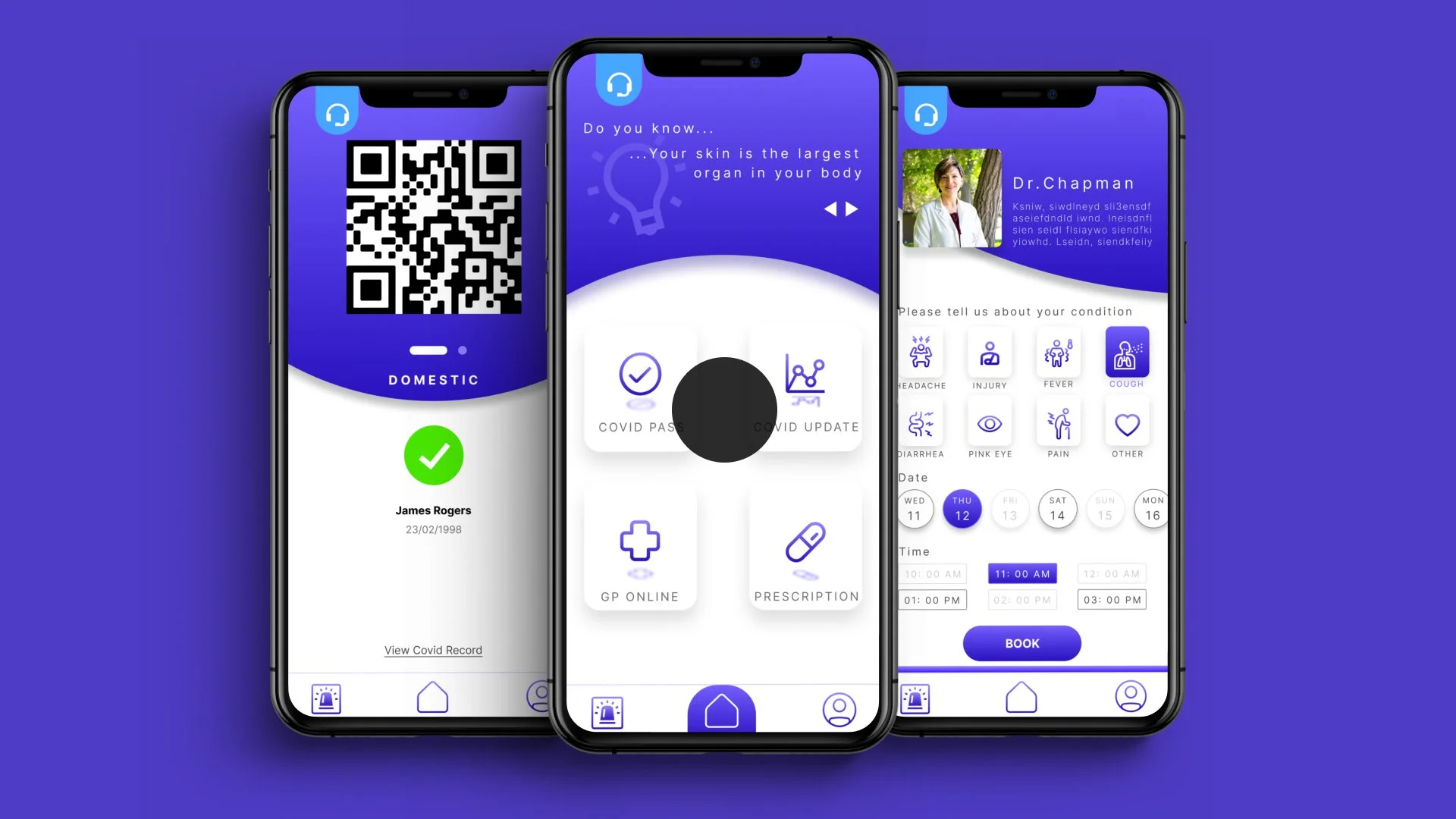
Users can access the Covid Pass page by swiping left, without needing to log into their account. The QR code will update automatically in the background for their convenience.

The app offers easily accessible information about COVID policies and dates, so users can easily browse through the information they need.
Users can choose their basic symptoms to the GP when booking an appointment, allowing them to communicate more effectively without hesitation.
With just one tap, users can access all the services they need from the home page of the app. To add some fun elements, there is also a "quote of the day" displayed at the top of the screen.
Future Improvements
After completing the final mockup, I conducted user testing with a few individuals and gathered feedback on potential improvements and future development. We discussed further enhancing the app's usability and incorporating new features based on user needs and feedback.
The product still lacks accessibility for elderly adults.
The font size is small and may be difficult for some users to read - consider implementing a text scaling function to increase the font size.
The interface appears cluttered with multiple services, which may make it difficult for users to navigate - consider implementing a function to minimize the interface and only display essential services on the screen or provide a search function to help users quickly find the service they need.
The product still lacks accessibilities to disabled people.
There is currently no support for users who have difficulty typing or interacting with the screen. One potential solution could be to implement a voice-activated system, allowing users to access the app's functions by speaking commands instead of using the touch screen. This would improve accessibility for users with physical or cognitive limitations that make it difficult to interact with the app traditionally.
The product does not show the status of the device.
Users cannot view their notifications, battery level, or another phone status while using the app. To address this issue, the app should always display the phone status on the top of the screen.
In summary, MediMe is currently functional but still needs improvements to reach the desired level of functionality. As the product relies on the National Health System, data access and security may pose significant challenges that require cooperation with the government to authorize certain services that connect with users' NHS data.
Regarding usability, there are still some details that need to be addressed, such as implementing notifications for prescription availability.
Future development of MediMe should prioritize a seamless and speedy user experience without adding unnecessary features that could hinder accessibility.
-
This project has highlighted the significance of taking a structured approach and breaking down tasks into manageable steps to ensure successful outcomes. It has also emphasized the importance of conducting thorough research, gathering user feedback, and making continuous improvements to meet the needs and expectations of the users.
-
This project taught me the importance of organising and following a structured design process. In the past, I focused more on ideation and creativity, neglecting thorough research and analysis. This approach led to challenges and setbacks in my previous projects as I often jumped between ideas and lost sight of the users' needs.
However, for this project, I adopted a systematic approach using the 5C model, which helped me stay focused and on track. By following the steps of research, analysis, design, creation, and evaluation, I could design and create the product based on the users' needs, making the project more efficient and effective.
-
While I have learned to design in a more organized manner, I need to continue practising as there were instances where I jumped into ideation before understanding user needs. It's important to stay committed to the process and prioritize user needs over product features.
-
My next objective is to make the 5C model a habitual part of my design process. I plan to apply this model in all of my future projects to ensure that I have a comprehensive understanding of the design process.
Reflection