

Role: Web Designer
Timeline: 06/2023 - 12/ 2023
Type: Commercial Case Study
Tools: Figma, Adobe CC, Wordpress
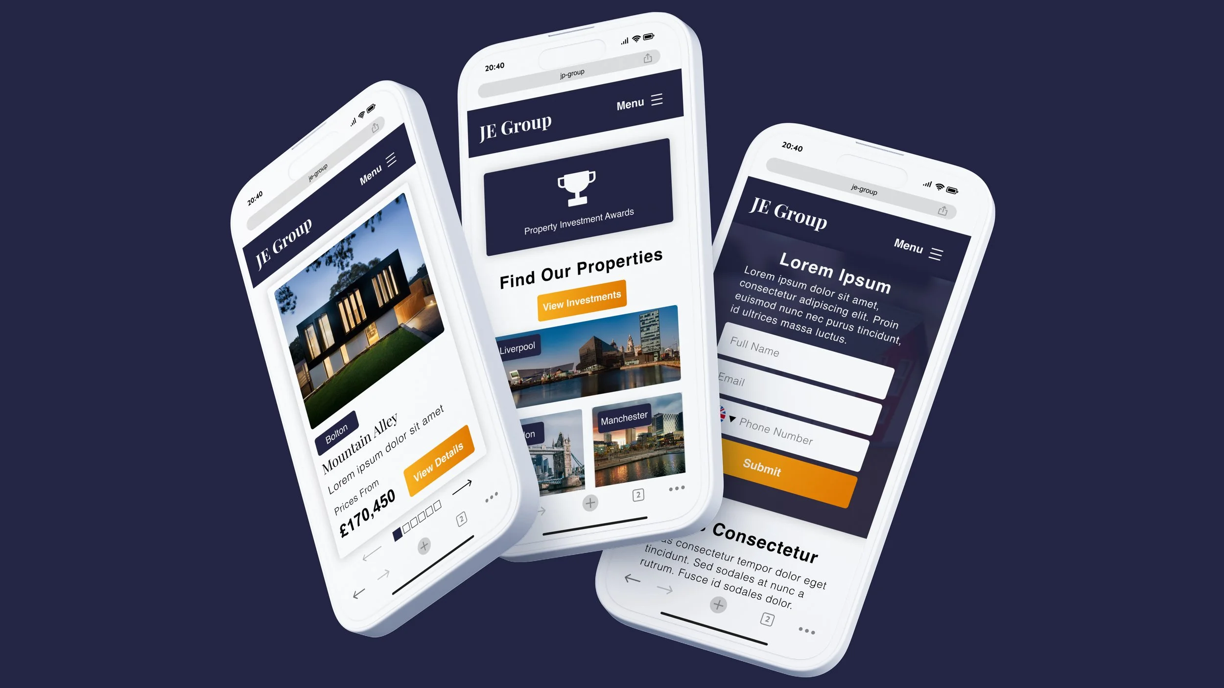
JE Group Website
Summary
This case study focuses on the development of a website for a property investment company. Due to NDA issues, I will mainly discuss my methodology and approach to the outcome, rather than sharing specific user data and detailed research findings. I'll be incorporating a different colour scheme and anything that's in line with the brand, while maintaining consistency in other elements like user flow, layout, and the utilisation of CTAs.
-
We've successfully launched the new website that has boosted our conversion rate for over 7% and is attracting more high-quality leads.
-
The old website is incapable of generating leads and potentially attracting higher-quality leads that could ultimately result in increased sales.
-
The goal is to develop a new website that is not just to generate more leads but also to ensure that these leads are of high quality.
-
We have taken two steps: first, we assessed the old website and utilised the data to develop an initial version of the new website. Afterward, we conducted A/B testing on the new website to determine its optimal layout.
-
Heatmap Analysis, Usability Evaluation, SWOT Analysis, Lo-Fi & Hi-Fi Mockup, A/B Testing
Team and Responsibilities
I joined the company after the main theme was completed by the developers. Therefore, some visual decisions had already been made. My role mainly focused on the UX aspect, enhancing visual elements with graphic designers, and working with the SEO and Marketing Team on decision-making. Due to the project's duration, I can't cover every detail but will highlight specific key points.
Target Audiences
Following a meeting with our marketing manager and directors, I've come to understand that our target users are middle-aged and above, interested in property investment. Typically, they face these issues:
A lack of familiarity with technology.
Difficulty reading content, often due to vision impairments.
Challenges with concentration, necessitating clearer guidance throughout the website.
Q1: what interests our visitors?
The first step involves gaining a deeper understanding of what our visitors prefer to see and interact with. This knowledge will be directly applied to identify user pain points and factors that deter them from making enquiries, even if they show interest in our offerings.
“I reviewed the data for the old website and tried to extract insights such as user behaviours, pain points, and potential improvements for the new website from it.”
HEAT MAP ANALYSIS
I began by using Mouseflow’s heat map to gather data on user behaviour. Here's an infographic I created to summarise the findings, as I am unable to show the actual visualised heat map:
Average number of clicks on top property listing pages.
Key Words: Paragraphs, links, or specific words containing vital information, frequently clicked/selected/highlighted by visitors.
Listing Images: Images showcasing the properties.
Investment Calculator: A tool enabling visitors to find suitable investment options.
Guide Downloads: CTAs for guides and brochures, allowing visitors to make inquiries and download materials.
Buttons: Any clickable button present on the page.
ATTENTION ANALYSIS
The attention heat map shows where visitors focus most on the page, with higher scroll levels indicating greater interest in those sections.
Average attention score on top article/information pages.
TAKE AWAY
2. First section needs to be designed with most attention.
The attention score analysis reveals that visitors focus most on the first paragraph, often bypassing the hero section to jump straight to the first substantial content in the fold. Therefore, it's important to carefully consider the content placed in this area to maximise visitor attraction and lead generation.
1. Visitors are more likely to engage with features that offer them benefits.
The 'click' heat map analysis indicates that visitors are particularly interested in engaging with features like downloadable guides and the investment calculator. These tools are appealing because they provide tangible results or outcomes following the interaction.
3. Visitors tend to 'scan' the information rather than 'read' it in detail.
The attention score analysis shows that most visitors on our website tend to quickly scroll through the pages rather than read each section thoroughly. This behavior suggests that lengthy text or paragraphs might be ignored by users. To address this, integrating CTAs or images in a strategic manner could be effective. These elements can act as focal points, potentially encouraging visitors to pause and engage more with the content during their quick scrolling.
The second approach is centered on the website's interactive and visual elements, focusing on how these aspects contribute to visitor drop-offs and a lack of conversions.
Q2: How do visitors access our website?
DEVICES
The first step I took was to gather usage data from our old website using Mouseflow. This was to gain an understanding of how users typically access and interact with our site. This data collection was essential in identifying user behaviour and preferences.

Over 70% of visitors use mobile devices…
According to data collected by Mouseflow, over 70% of users accessed our website through mobile devices. However, the main enquiry pages show that 60% of enquiries came from the desktop version. This indicates that there must be a significant issue on the mobile version that is preventing people from making enquiries on mobile devices.
“I evaluated the mobile usability of our old website to understand what aspects we managed well and what areas needed improvement.”
WEBSITE EVALUATION
Now that we have identified the issues, it's time for me to evaluate the old website and gain insight into the user pain points. Since the desktop conversion rate is high, boosting the mobile experience is currently a priority. Due to NDA constraints, I won't be able to share the original website. However, I can provide some examples that exhibit similar issues to what we encountered on our website:


USER PAINPOINTS
1. Small images for mobile devices.
Many of our images, like infographics and tables, are in a 16:9 aspect ratio, which makes them hard to view on mobile devices. Also, the CTAs are designed in a 16:5 ratio, similar to desktop banners, and this isn't well-suited for mobile use. This approach is not ideal, especially considering our target users are middle-aged and older.
2. Long paragraphs that pushes the CTA out of the screen.
Our main goal is to generate as many enquiries as possible, and one key strategy for this is to place a sufficient number of CTAs throughout the page. However, on mobile, our news pages are primarily content-focused, pushing the CTAs off-screen. Given that our scroll-through rate is just 40%, it's probable that users will leave the page before even seeing the first CTA. News pages are significant traffic attractions, rich in links and SEO strategies, so it's important to include CTAs on these pages to fully capitalise on their potential.
3. Layout wasn’t structured properly.
Each page lacks a clear layout structure, with CTAs, images, and content sections randomly placed, which often confuses users. This is evident in Mouseflow’s heat map, where visitors are unevenly drawn to various elements on the page, showing no clear pattern of engagement.
Our mobile version wasn’t optimised at all…
The analysis clearly shows that even though mobile has more traffic, the desktop version achieves a higher conversion rate due to its better functionality. This insight strongly suggests that for the new website, a 'mobile-first' approach should be prioritised to enhance functionality for the larger mobile audience.
“I conducted research and analysis to identify the gaps between our website and those of our competitors.”
SWOT ANALYSIS
Now is a good time to conduct a SWOT analysis of our old website. This analysis will help in understanding what aspects were working well, areas that needed improvement, potential opportunities for growth and innovation, and any external factors or challenges that could impact the website's performance. We also conducted a competitor analysis at this point and combined it with the SWOT analysis below:

TAKE AWAY
1. Users don't want to spend time 'finding' the information they need.
Some of our competitors effectively group their elements together, such as pairing a paragraph with a CTA or an image. This approach ensures that the CTA or image is directly related to the paragraph, maintaining consistency throughout the page.
2. We need to consistently provide visitors with interactive elements.
Since CTAs are crucial for generating leads, it would be ideal to have them appear on every scroll, allowing people to make enquiries immediately when they decide to. However, we need to balance this by not overwhelming them with too many buttons everywhere.
3. Each page should be organised into multiple, well-planned sections/templates.
Similar to the first point, when examining the pages as a whole, our competitors typically employ a clear content structure/template that naturally guides visitors throughout the entire page.
Let’s Start With Block-based Design
Having identified the key issues with our old website, we're now ready to strategically enhance it. Following discussions and brainstorming sessions with our team, managers, and director, we've chosen to adopt a 'mobile-first, desktop-second' approach. This means the mobile version will be extensively optimised. We all agreed on a block-based design, which will give the website an app-like appearance, making it easier to navigate and more user-friendly.
“Based on my research findings, I initiated ideas on potential solutions for our new website with our team.”
LOW FIDELITY MOCKUP
Below are some key sections of the website that I was involved in designing alongside the team.

Overview Card:
The principle to optimise the website for mobiles is to compress all information into small property cards. This allows visitors to see all key information and enquire without scrolling. Such design will be suitable for both desktop and mobile.


Visual Hotspot:
Our analysis indicated that visitors are more attracted to images than text. Consequently, we made the CTA blocks visually focused. For the desktop version, we kept a standard design, but for mobile, simplicity was prioritised to avoid content overflow. Our two primary strategies included reducing image size and emphasising the contact form below. Additionally, we considered converting the entire block into a content/visual-focused image that, when tapped, would bring up a pop-up contact form.


Information Overload:
To address the issue of information overload, which often results from having too much text on the screen, we implemented a 'read more' button. This allows visitors to access additional content at their discretion, while also aiding in quicker navigation through the page. This solution helps balance the need for comprehensive information with a clean, user-friendly interface.
Then, design two types of page layout…
After finalising the block-based elements, we'll use our prior research and analysis to enhance the overall UX of the page, rather than just focusing on small elements. To address the issue of users leaving the page after scrolling down to 40%, I've designed two types of layouts for different pages: interactive and informative. The interactive layout is for pages like landing pages, listing pages, or any page aimed at generating leads and enquiries. The informative layout, on the other hand, is more suited for articles and informational content.
INFORMATIVE LAYOUT - 40% CONTENT AT THE TOP
In the informative layout, the top 40% of the page will showcase key content like investment predictions and tax regulations to ensure that visitors first encounter the most important information which could lead to increased enquiries. Additionally, popular CTAs will be strategically placed to create 'hotspots' on the page and draw attention.
The layout will be commonly used in:
Menu pages such as About Us, Meet the Team and Support & After Care;
News articles such as long-form and short-form posts;
Investment information pages.


INTERACTIVE MOCK-UP - 40% CTA AT THE TOP
With interactive layouts, it’s important to place the key CTAs on the top 40% of the page. This doesn’t mean overwhelm the visitors with CTAs, but allowing them to have multiple opportunities to enquire before leaving the page.
The layout will be used in:
Landing pages;
Property Listing, Completed Properties and Construction Updates pages;
Guide Download pages.
It’s time to do some A/B Testings!
After navigating through a lengthy period filled with various challenges and communication issues among different parties, we finally launched our website. As with any new website development, it requires time to refine and perfect everything from visuals to UX. The first step we want to take with our website is to verify the effectiveness of our ideas. Therefore, conducting an A/B test is a must.
“I tested a range of website features to evaluate our conversion rates, setting a foundation for identifying future focus areas to enhance those rates.”
Move the download guide all the way to the top.
After two weeks of testing, we discovered that a significant number of visitors engaged with the 'Investment Guide Download' CTA, even though it was positioned at the bottom of the page. Consequently, we decided to move this CTA to the top to observe the impact on conversions in the upcoming weeks.

Incorporate the 'Investment Finder' among the initial CTAs.
Just like the 'Investment Guide Download' CTA, the 'Investment Finder' feature on other high-traffic pages, like news articles, also received considerable interaction. As a result, we've decided to add this CTA to the homepage to evaluate its performance over the next few weeks.

Discount promotions pop-up.
Our marketing manager has decided to promote the discount campaign and proposed transforming it into a global pop-up. This way, everyone who enters the site will see it. Visitors often engage more with elements offering them a benefit, making this an excellent opportunity to test its effectiveness.

Finally, we increased more than 5% conversion rate!
Fortunately, after implementing these changes, the website's conversion rate increased by more than 7% within 4 weeks of launching, indicating a successful launch and functionality. While the website may not yet be at its best in terms of UX and visuals, achieving these standards takes time and patience. As long as the website continues to generate leads and, subsequently, sales, it can be considered somewhat functional.

DESKTOP
MOBILE
REFLECTION
-
The project has been inspiring and has hugely improved my Web & UX design skills. Working as a bridge between the SEO and Marketing teams, I have not only developed my design thinking but also my communication skills. Expressing my own ideas is one aspect; effectively conveying and translating others' ideas into understandable forms across different departments is challenging yet rewarding.
-
The most challenging aspect of this project wasn't related to design or research, but rather the communication process between multiple parties. We had four groups involved in creating this website, including developers, the marketing team, the SEO team, and the company directors. Each group had different opinions on the project, leading to many misunderstandings about various concepts.
-
The biggest lesson I've learned from this project is the power of data. On many occasions, people don't grasp what you're saying until they see the proof. This realisation has been valuable in helping me build a system to convincingly present ideas using solid data analysis.
-
As mentioned in the 'evaluate' section, I will continue to apply 'data-driven' thinking throughout my design process to provide the best and most reliable results for users.